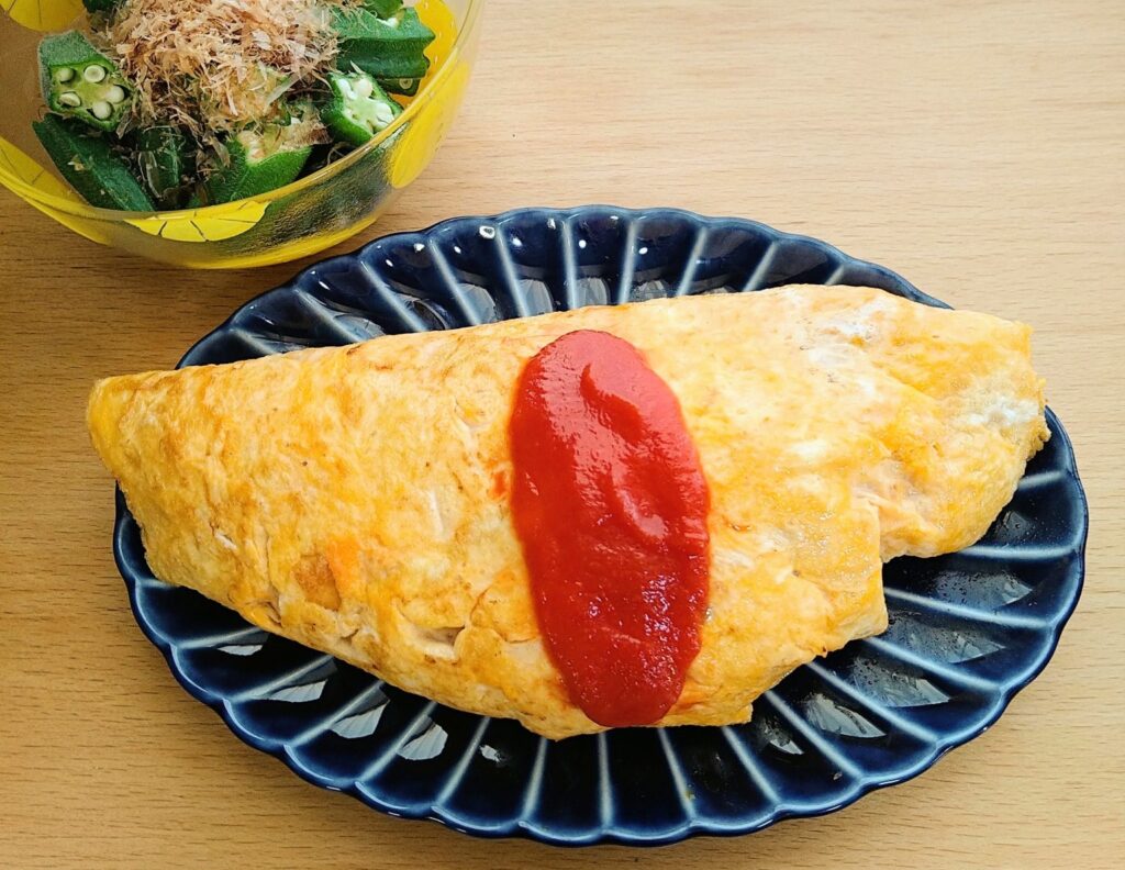

“Giyaman” is an old Japanese word for glassware, believed to derive from the Portuguese word diamante (diamond).
After the Meiji era (1868–1912), it gradually fell out of use and was replaced by the word “glass.”
Kaneko Kohyo’s Giyaman-tou is made of porcelain, but it has the translucency of glass and the deep luster of lacquerware. When you see it in person, the old word “Giyaman” fits perfectly.
The plate has ridges radiating outward from the center, naturally drawing the eye inward. It’s a design that puts the food front and center.
The series comes in four colors: Nasu-kon (eggplant blue), Urushi Brown, Sumi Black, and Rikyu Green — each named after traditional Japanese colors and materials.
I have two: Nasu-kon and Urushi Brown.
Both colors make ordinary meals look more appetizing. That much is consistent.
Nasu-kon makes food look fresher and more vibrant. Urushi Brown makes it look richer and more flavorful.
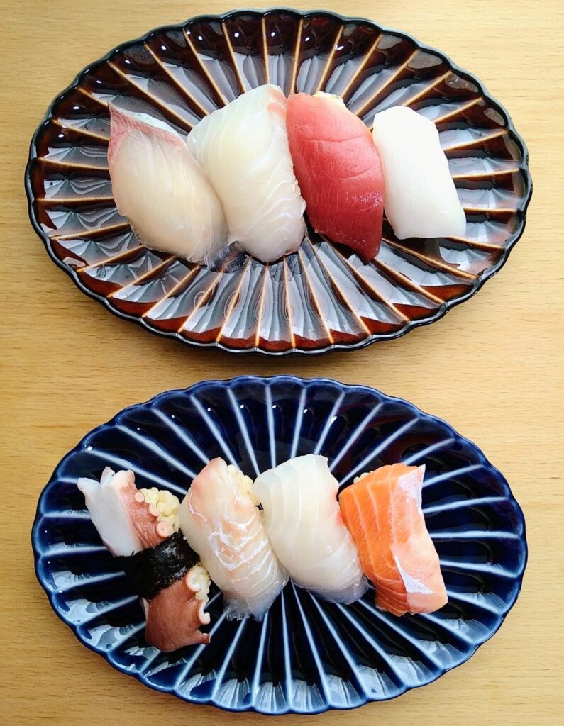
Supermarket Sushi on Giyaman
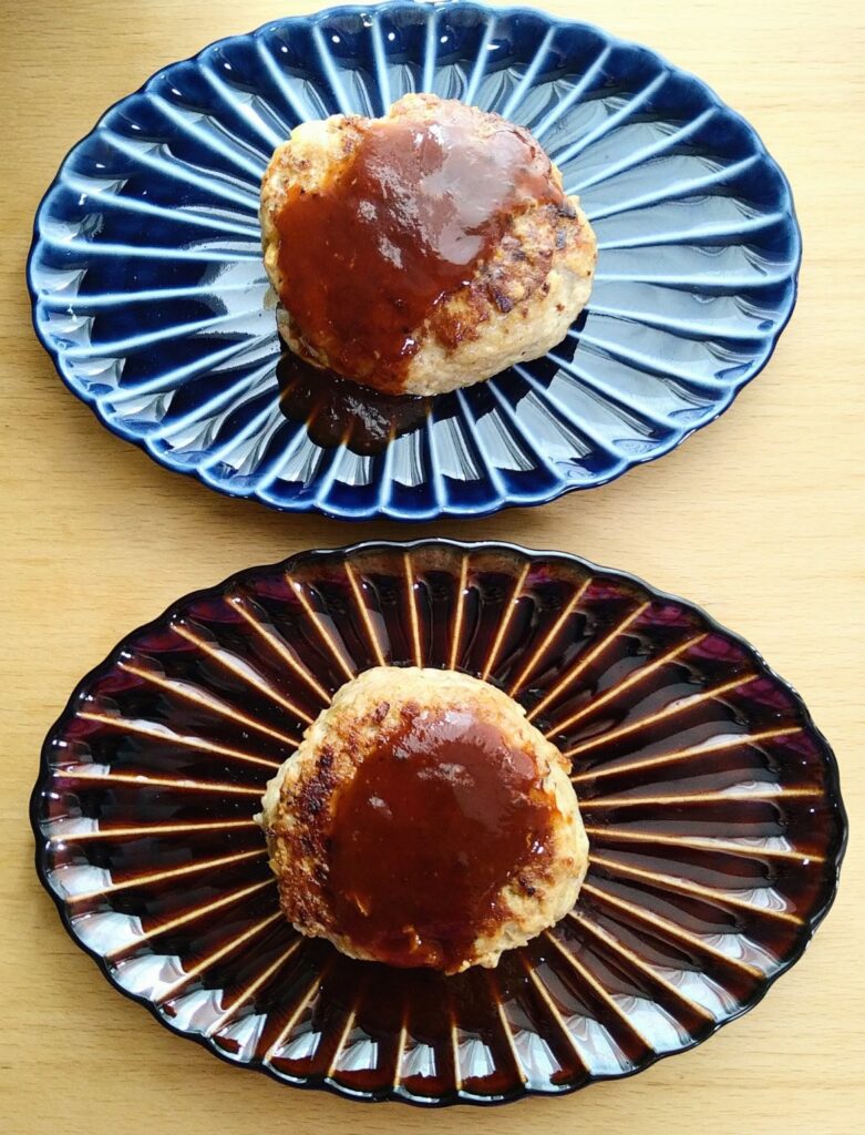
Hamburg Steak on Giyaman
It’s also practical. The glaze doesn’t stain easily, and it’s safe in the microwave for reheating. It’s light enough for everyday use.
This series took years of trial and error to complete.
The glaze used was so notoriously difficult to work with that potters used to say it would ruin a kiln. The result was Giyaman-tou.
Since its release in 2008, the series has found admirers around the world.
After using it, I can see why.
Leave a Reply